Assignment 1
Assignments | | Links:
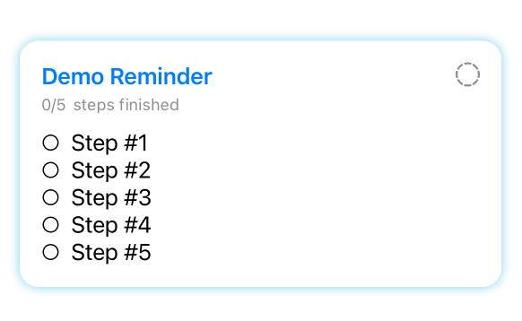
In this assignment, you will add a badge view on GroupCardView to show the number of reminders inside the group. Also, you will work on creating views to display reminders and reminder cards.
Stage 1 (30 Pts in total)
Display all reminder groups by using
ForEach.
Dummy data is provided in this assignment. You can find the dummy data inside the file UserData.swift.
Unlike in the demo made during the lecture, we used ForEach to loop over the names of groups. This time, you should loop through an array of ReminderGroups.
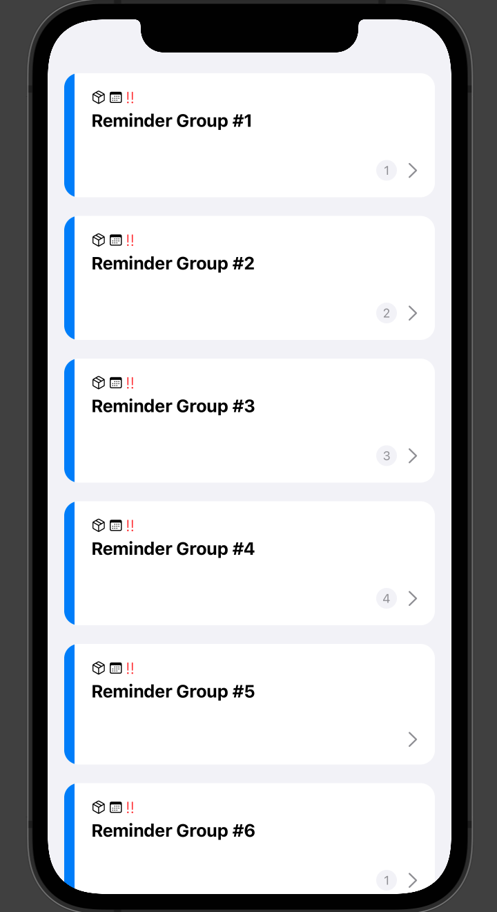
The expected layout for entire stage 1:
Stage 1.1 (10 Pts)
Navigate to file ContentView.swift and you will see a variable named groups. It uses dummy data.
Your task is to modify the code inside the ScrollView to display all ReminderGroups using the GroupCardView view we made during the lecture.
Grade Breakdown:
- (5 pt) Each card should have reasonable paddings around all edges.
- (5 pt) You should implement the
Identifiableprotocol to ensuregroupscan be used insideForEach, instead of giving it aKeyPath.
Note
FileGroupCardView.swiftis reorganized into the folder namedViews. A newReminder.swiftfile and oldReminderGroup.swiftfile are also moved to theModelsfolder. If you don’t understand why organize files in this way, no worries, as we will cover this topic, MVVM, in lecture 3.1.
Stage 1.2 (15 Pts)
In this sub-stage, you need to add a customized color to assets and use it as the background of ScrollView in files ContentView.swift.
The color you need to add is:
Any Appearance:
Content should be
secondarySystemBackgroundColorunderiOS System ColorsDark:
Content should be a customized sRGB color with the hex value of
#292929and 100% opacity.
You can name your color whatever you want.
Then, you must edit the file Color+Utility.swift to add this newly added color to Color by using extension. You must modify the static computed variable secondarySystemBackground to achieve that.
The last step is to use the new color as the background of the ScrollView inside file ContentView.swift.
Grade Breakdown:
- (5 pt) You should correctly add the required color into assets.
- (5 pt) You should correctly add the new color into the
Colorclass by usingextension. - (5 pt) You should correctly set the background color of
ScrollViewto the new color.
Stage 1.3 (5 Pts)
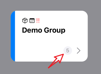
In this sub-stage, your goal is to add a “badge view” to the GroupCardView in order to show the number of reminders inside the corresponding group. You have the freedom to create and define your own “badge view” in the way you like.
You need to figure out where to add the badge view. The expected view of the badge view is like this:
Grade Breakdown:
- (5 pt) The placement and layout of the badge view should be identical to the image provided above.
Stage 2 (60 Pts in total)
Create the card view for displaying your reminder!
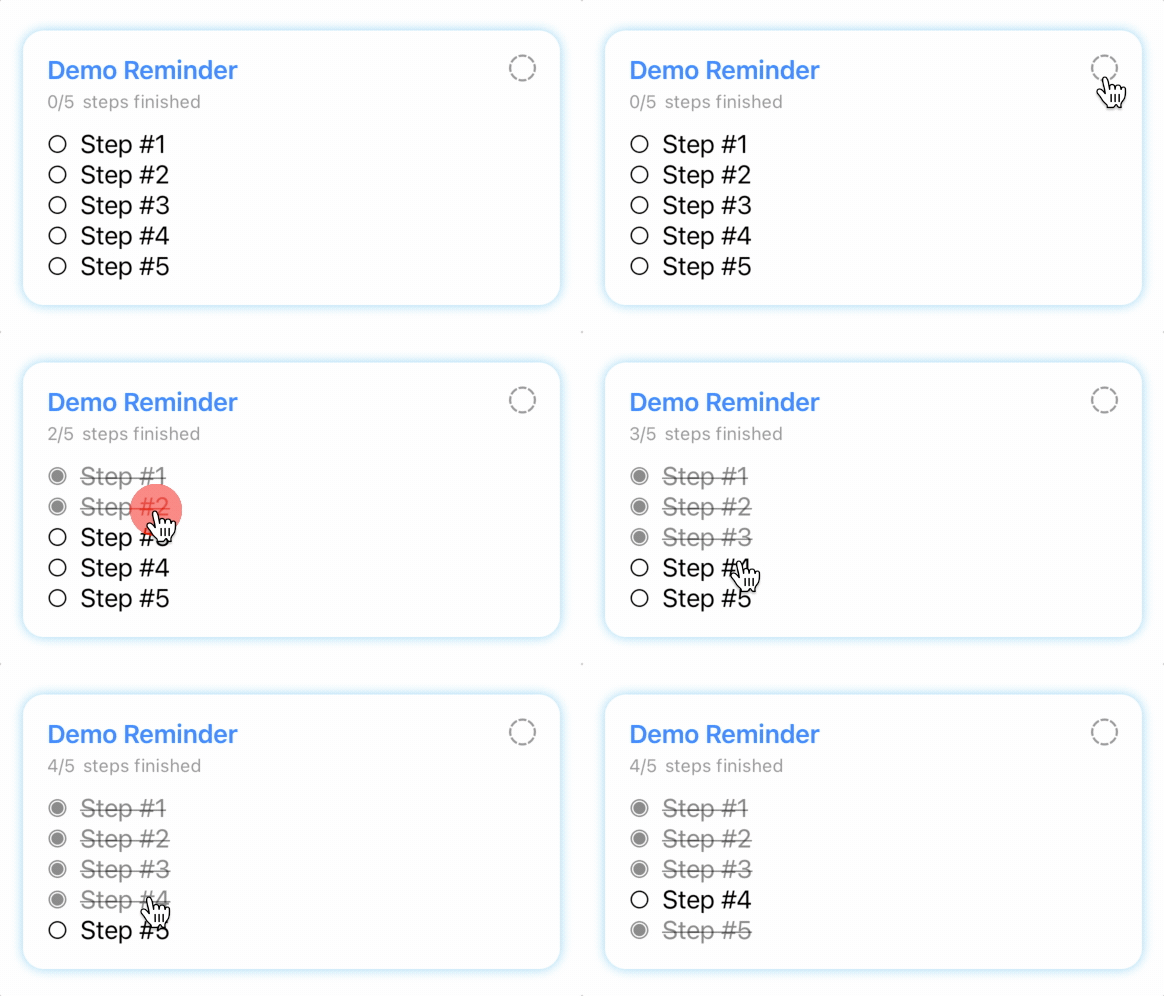
In this stage, your goal is to make a card view for displaying the reminder! You can refer to the GIFs under Stage 2.2 for expected layout and behavior.
Stage 2.1 (15 Pts)
Navigate to file Models/Reminder.swift, check out the structure of Reminder.
Each Reminder will have
- A array of
Steps. - A flag
finished, indicates whether the reminder is finished. - A field
title, indicates the name of this reminder.
Each Step will have
- A
id - A
finishedflag, indicates whether the step is finished. - A
content, indicates the content of this step.
You need to finish two functions (check out comments in the skeleton code):
- toggleStep(for finishedStep: Step)
- toggleFinish()
You also need to implement:
- when all steps are marked as finished, the reminder should also be marked as finished.
- When at least one of step is unfinished, the reminder should be marked as unfinished.
Grade Breakdown:
- (5 pt) Implement toggleStep correctly.
- (5 pt) Implement toggleFinish correctly.
- (5 pt) Reminder’s
finishflag updates correctly when steps’finishflags change.
Stage 2.2 (45 Pts)
In this sub-stage, you need to create a SwiftUI view named ReminderCardView.swift in the folder Views to display the details of a reminder in the card view.
Your ReminderCardView struct should look like this:
struct ReminderCardView: View {
    @State var reminder = UserData.getReminderWith(numSteps: 5, named: "Demo Reminder")

    /*
    Other codes.
    */
}
The expected result (GIFs):
A reminder with no steps:

A reminder with multiple steps:
Grade Breakdown:
- (5 pt) Layout and alignment should be the same as the GIFs shown above.
- (5 pt) Each element within this card view should have reasonable padding.
- (5 pt) Correctly show a placeholder when there is no step.
- (5 pt) Correctly show multiple steps with step contents.
- (5 pt) Able to correctly toggle the “Completed” icon (top right corner of the card) for the reminder with changing icon.
- (5 pt) Able to correctly toggle each individual step with strikethrough and gray out effect.
- (5 pt) Able to correctly update the string, which indicates the number of steps is finished.
- (5 pt) Show a prominent and visible shadow (no specification on color) when the reminder is not finished.
- (5 pt) Correctly disable shadow when the entire reminder is marked as finished and also apply a gray out effect on the entire card.
Stage 3 (10 Pts in total)
Commit, Push, and Submit
Remember to commit your code changes and push the change to GitHub before the deadline.
Submit your GitHub repository link on Canvas before the deadline.
Grade Breakdown:
- (10 pt) A valid GitHub repository link is submitted before the original deadline.
